Elements
The element’s ID is used to find, manage, and dispatch events for that element. GUI elements also support a set of common attributes including Enabled, Hidden, Visible, Font, WindowTitle, BackgroundColor, Geometry, ToolTip, StatusTip, StyleSheet, WindowOpacity, MinimumSize, MaximumSize, and FixedSize.
Note
For better management of elements, define an ID attribute. Not all example will contain an ID but keep that in mind.
You can then use the win.Find(‘ID’) to find and update an element and update an attribute win.Find(‘myButton’).Text = “Processing…”
Important
You need to create a Window to contain your element and attribute.
Check UI Element Layout page and UI Dispatcher functions for more details.
Window
WindowTitle
Type: string
Description
This attribute is used to display a text on the window’s title bar.
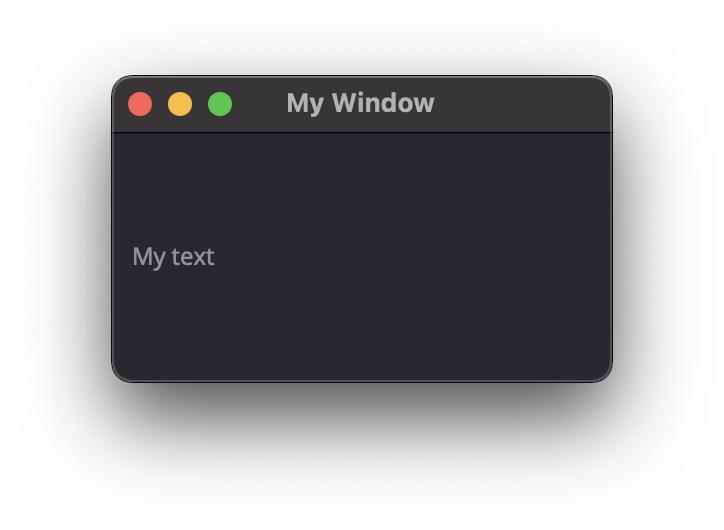
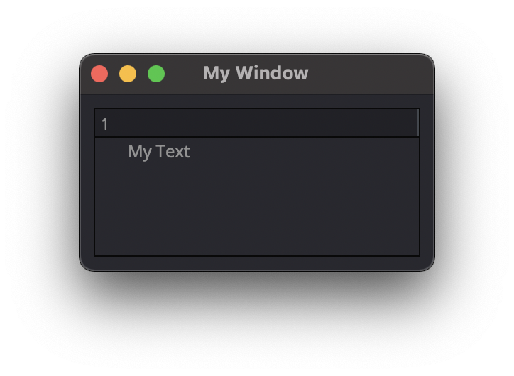
win = dispatcher.AddWindow({
    'ID': "my_window",
    'WindowTitle': 'My Window'
    },
    ui.VGroup([
            ui.Label({ 'ID': 'label_1', 'Text':'My text' })
    ])
)
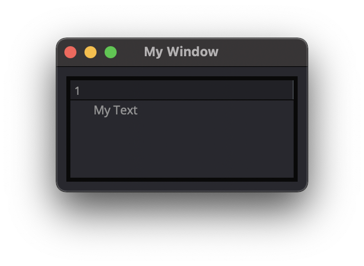
WindowOpacity
Type: float
Description
This attribute is used to set the Windows’s opacity, (default=1)
win = dispatcher.AddWindow({
    'ID': "my_window",
    'WindowOpacity': 0.5,  #50% opacity
    },
    ui.VGroup([
            ui.Label({ 'ID': 'label_1', 'Text':'My text' })
    ])
)
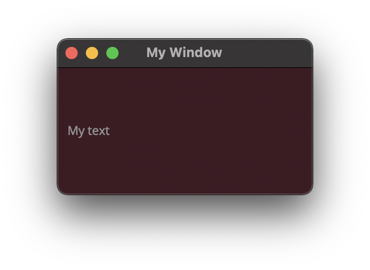
BackgroundColor
Type: dict RGBA
Description
This attribute is used change the Window’s background color.
win = dispatcher.AddWindow({
    'ID': "my_window",
    'BackgroundColor': {'R':0.6, 'G':0.1, 'B':0.2, 'A':0.2},
    },
    ui.VGroup([
            ui.Label({ 'ID': 'label_1', 'Text':'My text' })
    ])
)
Geometry
Type: [posX, posY, width, height]
Description
This attribute is used to change the Window’s position and size.
win = dispatcher.AddWindow({
    'ID': "my_window",
    'Geometry': [ 400,200,250,125 ],
    },
    ui.VGroup([
            ui.Label({ 'ID': 'label_1', 'Text':'My text' })
    ])
)
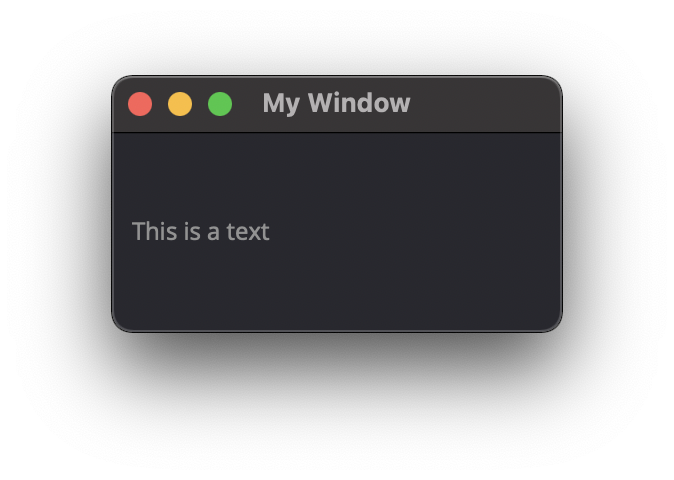
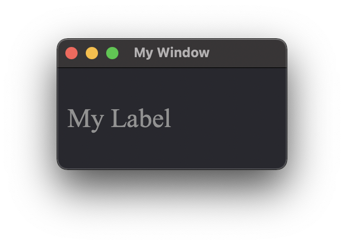
Label
Text
Description
This label attribute is used to display Text on the element.
Type: string
ui.Label({ 'ID':'label_1', 'Text': "This is a text" })
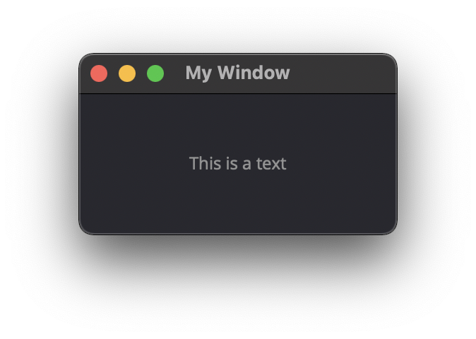
Alignment
Type: ({‘Parameter’: bool})
Description
This label attribute is used to align Text inside the Label element. Check out the qt5 documentation for more details
AlignCenter
AlignLeft
AlignRight
AlignHCenter
AlignVCenter
AlignTop
AlignBottom
AlignJustify
AlignBaseline
ui.Label({ 'ID':'label_1', 'Text': "This is a text", 'Alignment': { 'AlignCenter' : True } })
FrameStyle
Type: int
Description
This label attribute is used to Style the frame of the Label Element.
Check out the qt5 documentation for more details
0: NoFrame
1: Box
2: Panel
3: WinPanel
4: HLine
5: VLine
6: StyledPanel
other to try
ui.Label({ 'ID': 'label_1', 'Text':'My text', 'FrameStyle': 1 })
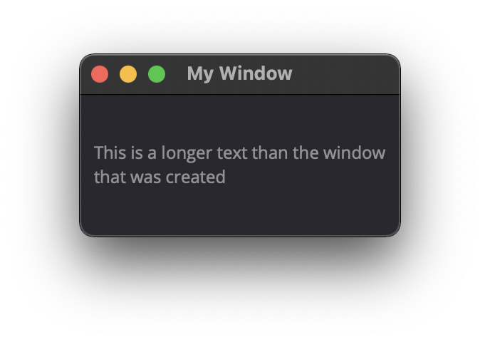
WordWrap
Type: bool
Description
This label attribute enable Wordwrap when the Text attribute is longer than the window’s width
ui.Label({ 'ID':'label_1', 'Text': "This is a longer text than the window that was created" , 'WordWrap': True })
Indent
Type: bool
Description
This label attribute
Note
Not yet tested
ui.Label({ ‘ID’:’label_1’, ‘Indent’: “” })
Margin
Type:
Description
This label attribute
Note
Not yet tested
ui.Label({ ‘ID’:’label_1’, ‘Margin’: “” })
StyleSheet
Type: string
Description
This attribute is set to apply a StyleSheet to the Element (similar to CSS)
css_style = f"""
color: rgb(205, 205, 245);
font-family: Garamond;
font-weight: bold;
font-size: 16px;
"""

ui.Label({ 'ID':'label_1', 'StyleSheet': css_style })
MinimumSize
Type: [width, height]
Description
This attribute is used to set a minimum width and height for the element if user resize the window.
ui.Label({ 'ID': 'label_1', 'Text':'My text','MinimumSize': [200, 200] })
MaximumSize
Type: [width, height]
Description
This attribute is used to set a maximum width and height for the element if user resize the window.
ui.Label({ 'ID': 'label_1', 'Text':'My text','MaximumSize': [400, 400] })
FixedSize
Type: [width, height]
Description
This attribute is used to set prevent users to resize the window.
Note
Not yet tested
ui.Label({ ‘ID’: ‘label_1’, ‘Text’:’My text’,’FixedSize’: [250, 125] })
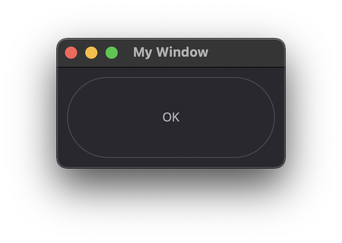
Button
Text
Type: string
Description
This attribute is used to display Text on the element.
ui.Button({ 'ID': 'ok_btn', 'Text': "OK" })
Down
Type: bool
Description
This label attribute is used to
Note
Not yet tested
ui.Button({ ‘ID’: ‘ok_btn’, ‘Down’: “” })
Checkable
Type: bool
Description
This label attribute is used to create a 2 states button.
ui.Button({ 'ID': 'ok_btn', 'Checkable': True })
|
|
Checked
Type: bool
Description
This attribute is used to set the Checked status to a Checkable button
ui.Button({ 'ID': 'ok_btn', 'Checkable': True, 'Checked': True })
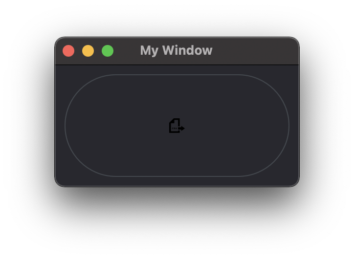
Icon
Type:
Description
This attribute is used to add ui.Icon object to the button.
ui.Button({ 'ID': 'ok_btn', 'Icon': ui.Icon({'File': r"UserData:/Scripts/images/csv.png"}) })
IconSize
Type: [int, int]
Description
This attribute is used to resize the Icon with lenght and height values.
ui.Button({'ID': 'ok_btn', 'Icon': ui.Icon({'File': r"UserData:/Scripts/images/csv.png"}), 'IconSize': [40, 40]})
Flat
Type: bool
Description
This label attribute is used to
Note
Not yet tested
ui.Button({ ‘ID’: ‘ok_btn’, ‘Flat’: “” })
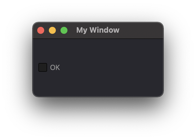
CheckBox
Text
Type: string
Description
This label attribute is used to display Text on the element.
ui.CheckBox({ 'ID': 'checkbox_1', 'Text': "OK" })
Down
Type: bool
Description
This attribute is used to
Note
Not yet tested
ui.CheckBox({ ‘ID’: ‘checkbox_1’, ‘Down’: “” })
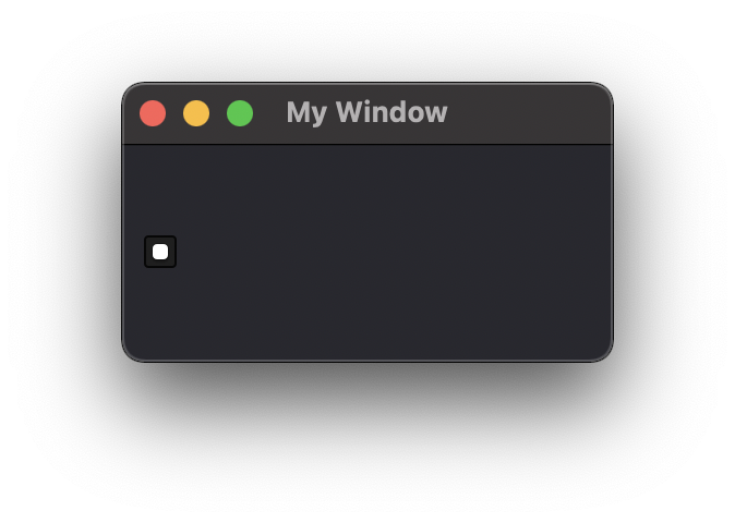
Checkable
Type: bool
Description
This label attribute is used to disable the option to check. (default=True)
ui.CheckBox({ 'ID': 'checkbox_1', 'Checkable': False })
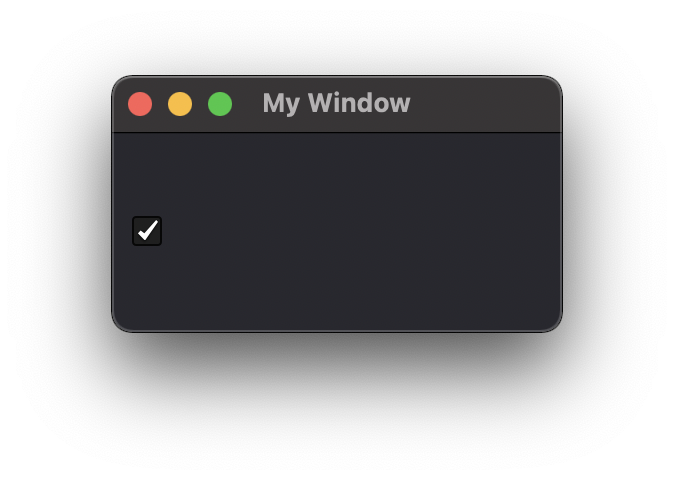
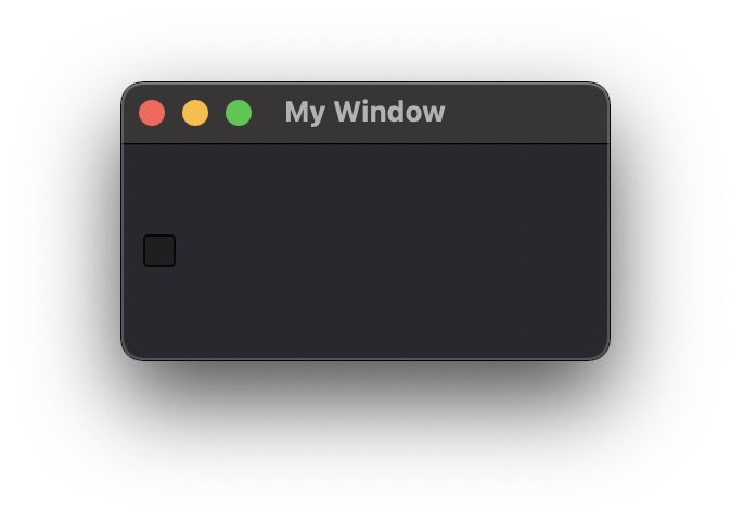
Checked
Type: bool
Description
This label attribute is used to change the checked status of the CheckBox.
ui.CheckBox({ 'ID': 'checkbox_1', 'Checked': True })

Tristate
Type:
Description
This label attribute is used to activate a 3 state checkbox
ui.CheckBox({ 'ID': 'checkbox_1', 'Tristate': True })
|
|
|
CheckState
Type:
Description
This label attribute is used to
Note
Not yet tested
ui.CheckBox({ ‘ID’: ‘checkbox_1’, ‘CheckState’: “” })
ComboBox
Refer to the UI Element Function page to AddItems to the ComboBox list
ItemText
Type:
Description
This label attribute is used to
Note
Not yet tested
- ui.ComboBox({ ‘ID’: ‘combo_1’, ‘ItemText’: ‘test’ })
win.Find(“combo_1”).AddItems([“Blue”,”Cyan”,”Green”,”Yellow”])
Editable
Type: bool
Description
This attribute is used to allow users to add items to the ComboBox
Note that those items are not added permanently to the ComboBox list.
ui.ComboBox({ 'ID': 'combo_1', 'Editable': True })
CurrentIndex
Type:
Description
This attribute is used to get or change the selected item from the ComboBox
ui.ComboBox({ 'ID': 'combo_1' })
    win.Find("combo_1").AddItems(["Blue","Cyan","Green","Yellow","Red","Pink","Purple","Fuchsia","Rose","Lavender","Sky","Mint","Lemon","Sand","Cocoa","Cream"])

    print(win.Find("combo_1").CurrentIndex) #0 will be printed for the first item (default)

    win.Find("combo_1").CurrentIndex =  3 #"Yellow" will be selected
CurrentText
Type: string
Description
This attribute is used to get the Text from the selected Item
ui.ComboBox({ 'ID': 'combo_1' })

    win.Find("combo_1").AddItems(["Blue","Cyan","Green","Yellow","Red"])
print(win.Find("combo_1").CurrentText)  # print the first item by default "Blue"
Count
Type: int
Description
This label attribute is used to
Note
Not yet tested
ui.ComboBox({ ‘ID’: ‘combo_1’, ‘Count’: 3 })
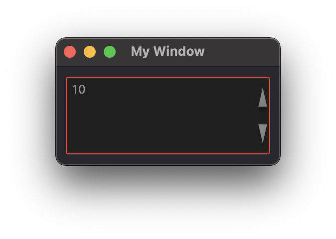
SpinBox
Value
Type: int
Description
This spinbox attribute is used to set the current SpinBox value (default max=99)
ui.SpinBox({ 'ID': 'spin_1', 'Value': 10 })
Minimum
Type: int
Description
This spinbox attribute is used to set a Minimum value to the SpinBox
ui.SpinBox({ 'ID': 'spin_1', 'Minimum': 5 })
Maximum
Type: int
Description
This spinbox attribute is used to set a Maximum value to the SpinBox
ui.SpinBox({ 'ID': 'spin_1', 'Maximum': 8 })
SingleStep
Type: int
Description
This spinbox attribute is used to set the step value of the SpinBox
ui.SpinBox({ 'ID': 'spin_1', 'SingleStep': 2 })
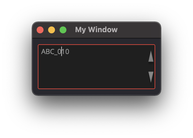
Prefix
Type: string
Description
This spinbox attribute is used add a text prefix to the spinbox value
ui.SpinBox({ 'ID': 'spin_1', 'Prefix': "ABC_0" })
Suffix
Type: string
Description
This spinbox attribute is used add a text suffix to the spinbox value
ui.SpinBox({ 'ID': 'spin_1', 'Suffix': '_XYZ' })
Alignment
Type:
Description
This label attribute is used to
Note
Not yet tested
ui.SpinBox({ ‘ID’: ‘spin_1’, ‘Alignment’: “” })
ReadOnly
Type: bool
Description
This spinbox attribute is used limit the spinbox usage to the side arrows. Keyboard entry disabled
ui.SpinBox({ 'ID': 'spin_1', 'ReadOnly': True })
Wrapping
Type: bool
Description
This spinbox attribute is used to allow the value to return to the Minimum value when passed Maximum and vice-versa
ui.SpinBox({ 'ID': 'spin_1', 'Wrapping': True })
Slider
Value
Type: int
Description
This slider attribute is used to set the slider value
ui.Slider({ 'ID': 'slider_1', 'Value': 5 })
Minimum
Type: int
Description
This slider attribute is used to set a Minimum value to the Slider
ui.Slider({ 'ID': 'slider_1', 'Minimum': 2 })
Maximum
Type: int
Description
This slider attribute is used to set a Maximum value to the Slider
ui.Slider({ 'ID': 'slider_1', 'Maximum': 8 })
SingleStep
Type: int
Description
This slider attribute is used to set the step value of the slider
ui.Slider({ 'ID': 'slider_1', 'SingleStep': 2 })
PageStep
Type:
Description
This label attribute is used to
Note
Not yet tested
ui.Slider({ ‘ID’: ‘slider_1’, ‘PageStep’: “” })
Orientation
Type: string
Description
This slider attribute is used to set the orientation of the slider
Vertical
Horizontal
ui.Slider({ 'ID': 'slider_1', 'Orientation': 'Vertical' })
Tracking
Type: bool
Description
This label attribute is used to… (default=False)
Note
Not yet tested
ui.Slider({ ‘ID’: ‘slider_1’, ‘Tracking’: “” })
SliderPosition
Type:
Description
This label attribute returns the current Slider value.
print(win.Find('slider_1').SliderPosition) #default=0
LineEdit
Text
Type: string
Description
This attribute is used to set and display the Text in the LineEdit box. For Multi-Line text, use the TextEdit element.
Note
Not yet tested
ui.LineEdit({ ‘ID’: ‘le_1’, ‘Text’: “My Text” })
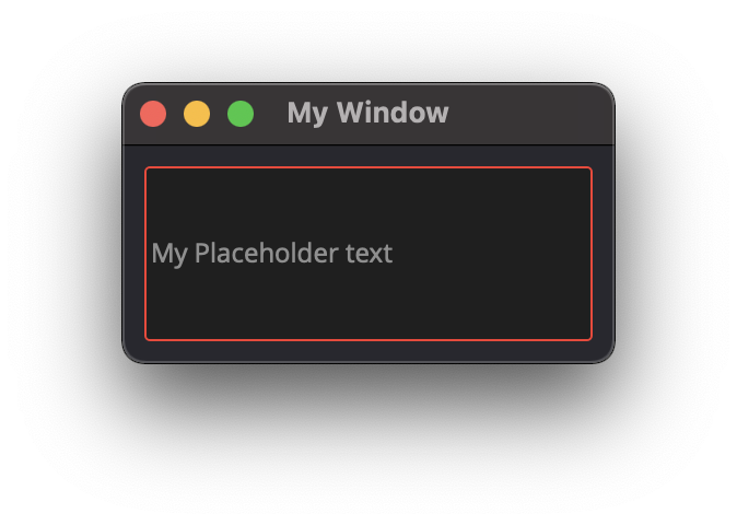
PlaceholderText
Type: string
Description
This attribute is used to display a text in the lineEdit box. The PlaceholderText will be replaced by user input.
ui.LineEdit({ 'ID': 'le_1', 'PlaceholderText': "My Placeholder text" })
Font
Type:
Description
This attribute is used to
Note
Not yet tested
ui.LineEdit({ ‘ID’: ‘le_1’, ‘Font’: “” })
MaxLength
Type: int
Description
This attribute is used to limit the user input to x(int) character
ui.LineEdit({ 'ID': 'le_1', 'MaxLength': 10 })
ReadOnly
Type: bool
Description
This attribute is used to set the LineEdit to be Read-Only.
ui.LineEdit({ 'ID': 'le_1', 'ReadOnly': True })
Modified
Type:
Description
This label attribute is used to
Note
Not yet tested
ui.LineEdit({ ‘ID’: ‘le_1’, ‘Modified’: “” })
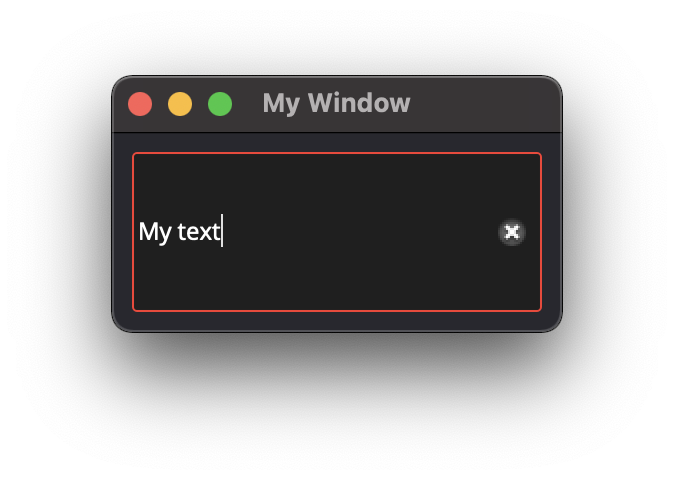
ClearButtonEnabled
Type: bool
Description
This attribute is used to add a button to clear the text field
ui.LineEdit({ 'ID': 'le_1', 'ClearButtonEnabled': True })
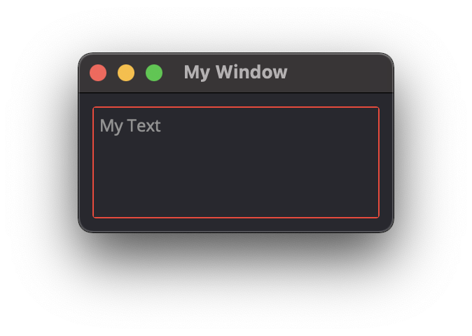
TextEdit
Text
Type: string
Description
This attribute is used to set and display the Text in the TextEdit box.
ui.TextEdit({ 'ID': 'te_1', 'Text': "My Text" })
PlaceholderText
Type: string
Description
This attribute is used to display a text in the lineEdit box.
The PlaceholderText will be replaced by user input.
ui.TextEdit({ 'ID': 'te_1', 'PlaceholderText': "My Placeholder Text" })
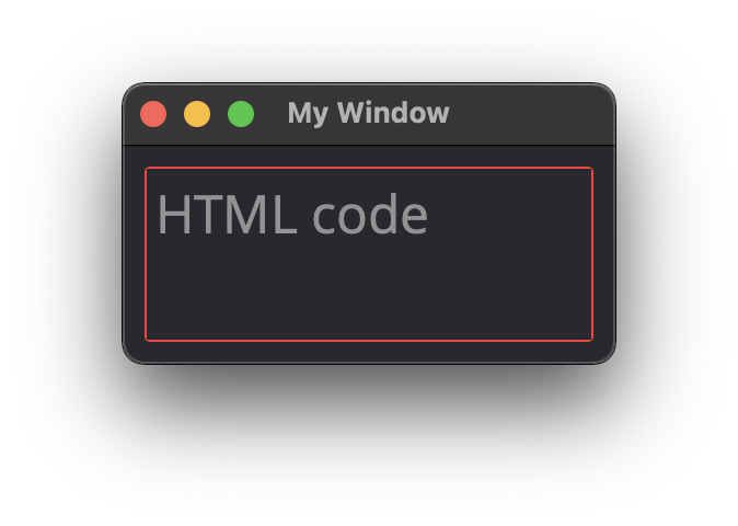
HTML
Type: string
Description
This attribute is used render HTML code inside the TextEdit box
ui.TextEdit({ 'ID': 'te_1', 'HTML': "<h1>HTML code</h1>" })
Font
Type: ui.Font
Description
This attribute is used to specify a Font element with parameters
ui.TextEdit({ 'ID': 'te_1', 'Font': ui.Font({ 'Family': "Times New Roman" }) })
Alignment
Type: dict
Description
This label attribute is used to
Note
Not yet tested
ui.TextEdit({ ‘ID’: ‘te_1’, ‘Alignment’: “” })
ReadOnly
Type: bool
Description
This label attribute is used to set the TextEdit to ReadOnly. User cannot add or remove text.
ui.TextEdit({ 'ID': 'te_1', 'ReadOnly': True })
TextColor
Type: dict(r,g,b, a) ?
Description
This label attribute is used to
Note
Not yet tested
ui.TextEdit({ ‘ID’: ‘te_1’, ‘TextColor’: { ‘R’:1, ‘G’: 0, ‘B’:0, ‘A’:1 })
TextBackgroundColor
Type: string
Description
This label attribute is used to
Note
Not yet tested
ui.TextEdit({ ‘ID’: ‘te_1’, ‘TextBackgroundColor’: “blue” })
TabStopWidth
Type: int
Description
This attribute is used to set the width of the Tab when inserted.
ui.TextEdit({ 'ID': 'te_1', 'TabStopWidth': 50 })
Lexer
Type:
Description
This attribute is used to
Note
Not yet tested
ui.TextEdit({ ‘ID’: ‘te_1’, ‘Lexer’: })
LexerColors
Type:
Description
This attribute is used to
Note
Not yet tested
ui.TextEdit({ ‘ID’: ‘te_1’, ‘LexerColors’: })
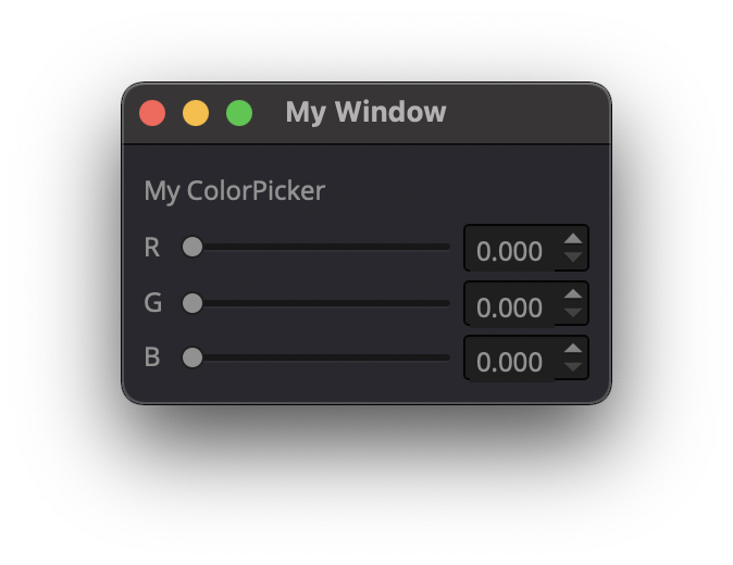
ColorPicker
Text
Type: string
Description
This attribute is used to display a Text with the ColorPicker
ui.ColorPicker({ 'ID': 'colorpicker_1', 'Text': "My ColorPicker" })
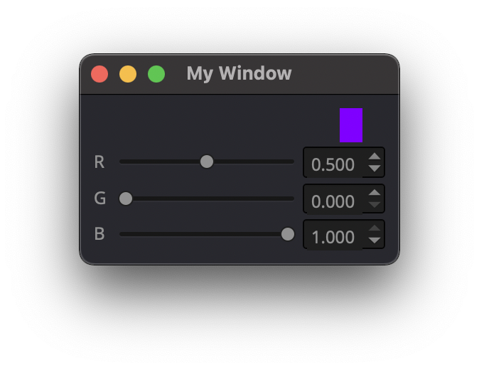
Color
Type: dict
Description
This attribute is used to set a default color to the ColorPicker. Each RGB color using a float value betwee 0 and 1.
ui.ColorPicker({ 'ID': 'colorpicker_1', 'Color': {'R':0.5, 'G':0, 'B':1.0} })
Tracking
Type: bool
Description
This label attribute is used to
Note
Not yet tested
ui.ColorPicker({ ‘ID’: ‘colorpicker_1’, ‘Tracking’: True })
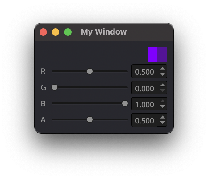
DoAlpha
Type: bool
Description
This attribute is used to include Alpha value in the RGB ColorPicker
ui.ColorPicker({ 'ID': 'colorpicker_1', 'DoAlpha': True })
Font
Family
Type: string
Description
This attribute is used to set the font family. Combine with an element using text.
Times New Roman
Arial
list available font…
ui.Label({'Text': "My Label", "Font": ui.Font({ 'Family': "Times New Roman" }),
StyleName
Type: string
Description
This label attribute is used to
Note
Not yet tested
ui.Font({ ‘StyleName’: “” })
PointSize
Type: int
Description
This attribute is used to set a size to the Font (pt).
ui.Label({'Text': "My Label", "Font": ui.Font({ 'PointSize': 36 }),
PixelSize
Type: int
Description
This attribute is used to set a size to the Font (px).
ui.Label({'Text': "My Label", "Font": ui.Font({ 'PixelSize': 36 }),
Bold
Type: bool
Description
This attribute is used to apply bold to the text
Note
Do not seems to apply on all fonts
ui.Label({‘Text’: “My Label”, “Font”: ui.Font({ ‘Bold’: True }),
Italic
Type: bool
Description
This attribute is used to apply Italic to the text
ui.Label({'Text': "My Label", "Font": ui.Font({ 'Italic': True }),
Underline
Type: bool
Description
This attribute is used to add a line under the text
ui.Label({'Text': "My Label", "Font": ui.Font({ 'Underline': True }),
Overline
Type: bool
Description
This attribute is used to add a line on top of the text
ui.Label({'Text': "My Label", "Font": ui.Font({ 'Overline': True }),
StrikeOut
Type: bool
Description
This attribute is used to add a line through the text
ui.Label({'Text': "My Label", "Font": ui.Font({ 'StrikeOut': True }),
Kerning
Type:
Description
This attribute is used to
Note
Not yet tested
ui.Font({ ‘Kerning’: 24 })
Weight
Type: int, float
Description
This attribute is used to set a size relative to other element of the group. Element with Weight 0.5 will be twice the size of an element with Weight 0.25
Note
Not yet tested
ui.Font({ ‘Weight’: 0.25 })
Stretch
Type: bool
Description
This attribute is used to
Note
Not yet tested
ui.Font({ ‘Stretch’: True })
MonoSpaced
Type: bool
Description
This label attribute is used to
Note
Not yet tested
ui.Font({ ‘MonoSpaced’: True })
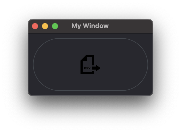
Icon
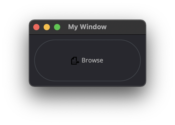
File
Type: string
Description
This attribute is used to point to an image file path to use for the Icon Element. Need to be associated with an element supporting Icon attribute. (ie: ui.Button)
.png
.jpg
ui.Button({ 'ID': "Browse", 'Text': " Browse", "Icon": ui.Icon({'File': r"UserData:/Scripts/images/csv.png"})})
TabBar
Note
Before you can edit TabBar attributes, you need to create a TabBar element, then use the UI Element function AddTab()
Also note that TabBar has TabBar Property Array
CurrentIndex
Type: int
Description
This attribute is used to set the current TabBar index
Note
Not yet tested
- ui.TabBar({ ‘ID’:’tabbar_1’, ‘CurrentIndex’: 3 })
win.Find(‘tabbar_1’).AddTab(‘Tab1’)
win.Find(‘tabbar_1’).AddTab(‘Tab2’)
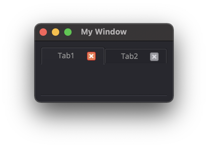
TabsClosable
Type: bool
Description
This attribute is used to add a button to close tabs
ui.TabBar({ 'ID':'tabbar_1', 'TabsClosable': True })
    win.Find('tabbar_1').AddTab('Tab1')
win.Find('tabbar_1').AddTab('Tab2')
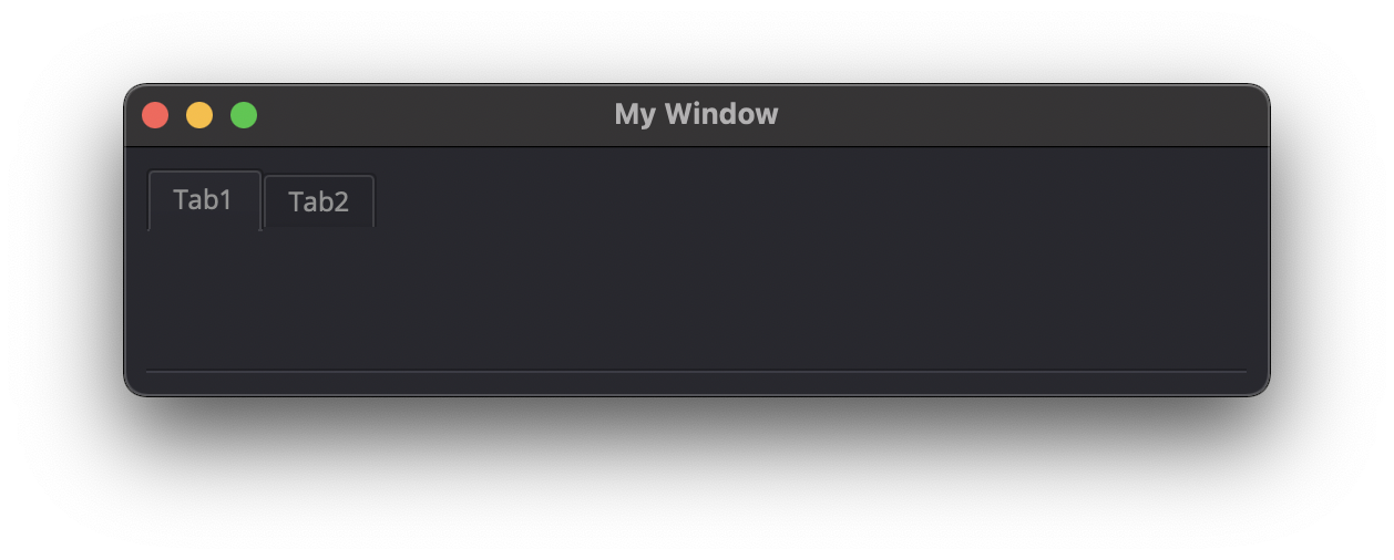
Expanding
Type: bool
Description
This attribute is used to force tabs to expand or not on Window resize. (default=True)
ui.TabBar({ 'ID':'tabbar_1', 'Expanding': False })
AutoHide
Type: bool
Description
This attribute is used to
Note
Not yet tested
ui.TabBar({ ‘AutoHide’: True })
Movable
Type: bool
Description
This attribute is used to enable Drag’n Drop to reorder tabs (default=False)
ui.TabBar({ 'ID':'tabbar_1', 'Movable': True })
DrawBase
Type: bool
Description
This attribute is used to
Note
Not yet tested
ui.Tabbar({ ‘DrawBase’: True })
DocumentMode
Type: bool
Description
This attribute is used to
Note
Not yet tested
ui.Tabbar({ ‘DocumentMode’: True })
ChangeCurrentOnDrag
Type: bool
Description
This attribute is used to
Note
Not yet tested
ui.Tabbar({ ‘ChangeCurrentOnDrag’: True })
Stack
Description #NotInReadme
Stack are groups of Elements used with TabBar to manage each pages
ui.Stack({'ID':'stack_1'})
CurrentIndex
toolbox_items[‘Stack’].CurrentIndex = 0
AddChild()
toolbox_items[‘Stack’].AddChild(ui.Button({‘ID’: “Browse”, “Icon”: ui.Icon({‘File’: r”UserData:/Scripts/images/test.gif”}), ‘IconSize’ : [15, 15]}))
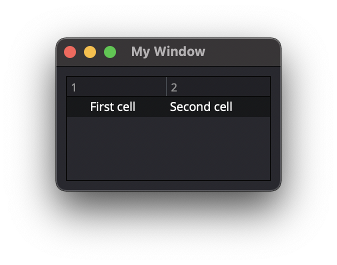
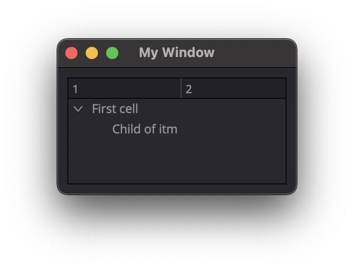
Tree
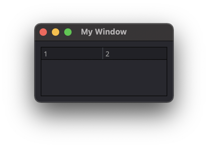
ColumnCount
Type: int
Description
This attribute is used to set the number of column in the Tree
ui.Tree({ 'ID':'my_tree', 'ColumnCount': 2 })
SortingEnabled
Type: bool
Description
This attribute enables sorting of the TreeItems elements. (default=False)
ui.Tree({ 'ID':'my_tree', 'SortingEnabled': True })
ItemsExpandable
Type: bool
Description
This attribute is used to
Note
Not yet tested
ui.Tree({ ‘ID’:’my_tree’, ‘ItemsExpandable’: True })
ExpandsOnDoubleClick
Type: bool
Description
This attribute is used to
Note
Not yet tested
ui.Tree({ ‘ID’:’my_tree’, ‘ExpandsOnDoubleClick’: True })
AutoExpandDelay
Type: bool
Description
This attribute is used to
Note
Not yet tested
ui.Tree({ ‘ID’:’my_tree’, ‘AutoExpandDelay’: True })
IconSize
Type: int
Description
This attribute is used to
Note
Not yet tested
ui.Tree({ ‘ID’:’my_tree’, ‘Icon’: ui.Icon({‘File’: r”UserData:/Scripts/images/logo.png”}, ‘IconSize’: 12 })
RootIsDecorated
Type: bool
Description
This attribute is used to
Note
Not yet tested
ui.Tree({ ‘ID’:’my_tree’, ‘RootIsDecorated’: True })
Animated
Type: bool
Description
This attribute is used to
Note
Not yet tested
ui.Tree({ ‘ID’:’my_tree’, ‘Animated’: True })
AllColumnsShowFocus
Type: bool
Description
This attribute is used to
Note
Not yet tested
ui.Tree({ ‘ID’:’my_tree’, ‘AllColumnsShowFocus’: True })
WordWrap
Type: bool
Description
This attribute is used to
Note
Not yet tested
- ui.Tree({ ‘ID’:’my_tree’, ‘WordWrap’: True })
itm = win.Find(‘my_tree’).NewItem()
- itm.Text[0] = “too long text for the cell”
itm.Text[1] = “this is also too long”
win.Find(‘my_tree’).AddTopLevelItem(itm)
TreePosition
Type:
Description
This attribute is used to
Note
Not yet tested
ui.Tree({ ‘ID’:’my_tree’, ‘TreePosition’: })
SelectionBehavior
Type:
Description
This attribute is used to
Note
Not yet tested
ui.Tree({ ‘ID’:’my_tree’, ‘SelectionBehavior’: })
SelectionMode
Type:
Description
This attribute is used to
Note
Not yet tested
ui.Tree({ ‘ID’:’my_tree’, ‘SelectionMode’: })
UniformRowHeights
Type: bool
Description
This attribute is used to
Note
Not yet tested
ui.Tree({ ‘ID’:’my_tree’, ‘UniformRowHeights’: True })
Indentation
Type: bool
Description
This attribute is used to
Note
Not yet tested
ui.Tree({ ‘ID’:’my_tree’, ‘Indentation’: True })
VerticalScrollMode
Type: bool
Description
This attribute is used to
Note
Not yet tested
ui.Tree({ ‘ID’:’my_tree’, ‘VerticalScrollMode’: True })
HorizontalScrollMode
Type: bool
Description
This attribute is used to
Note
Not yet tested
ui.Tree({ ‘ID’:’my_tree’, ‘HorizontalScrollMode’: True })
AutoScroll
Type: bool
Description
This attribute is used to
Note
Not yet tested
ui.Tree({ ‘ID’:’my_tree’, ‘AutoScroll’: True })
AutoScrollMargin
Type: bool
Description
This attribute is used to
Note
Not yet tested
ui.Tree({ ‘ID’:’my_tree’, ‘AutoScrollMargin’: True })
AlternatingRowColors
Type: bool
Description
This attribute is used activate atlerning row colors on the Tree (default=False)
ui.Tree({ 'ID':'my_tree', 'AlternatingRowColors': True })
FrameStyle
Type: int
Description
This attribute is used to Style the frame of the Tree Element.
Check out the qt5 documentation for more details
0: NoFrame
1: Box
2: Panel
3: WinPanel
4: HLine
5: VLine
6: StyledPanel
other to try
ui.Tree({ 'ID':'my_tree', 'FrameStyle': 1 })
LineWidth
Type: int
Description
This attribute is used to adjust the line with of the selected FrameStyle
FrameStyle is required
ui.Tree({ 'ID':'tree_1', 'FrameStyle': 1, 'LineWidth': 4 })
MidLineWidth
Type: int
Description
This attribute is used to
Note
Not yet tested
ui.Tree({ ‘ID’:’my_tree’, ‘MidLineWidth’: 2 })
FrameRect
Type: bool
Description
This attribute is used to
Note
Not yet tested
ui.Tree({ ‘ID’:’my_tree’, ‘FrameRect’: True })
FrameShape
Type:
Description
This attribute is used to
Note
Not yet tested
ui.Tree({ ‘ID’:’my_tree’, ‘FrameShape’: })
FrameShadow
Type: bool
Description
This attribute is used to
Note
Not yet tested
ui.Tree({ ‘ID’:’my_tree’, ‘FrameShadow’: True })
TreeItem
Note
Before you can edit TreeItem attributes, you need to create a Tree element, then use the UI Element function to add Item to the Tree
itm = win.Find('my_tree').NewItem()
win.Find('my_tree').AddTopLevelItem(itm)
Selected
Type: bool
Description
This attribute is used to define the selected status to an item of the Tree. (default=False)
itm = win.Find('my_tree').NewItem()
win.Find('my_tree').AddTopLevelItem(itm)

itm.Selected = True
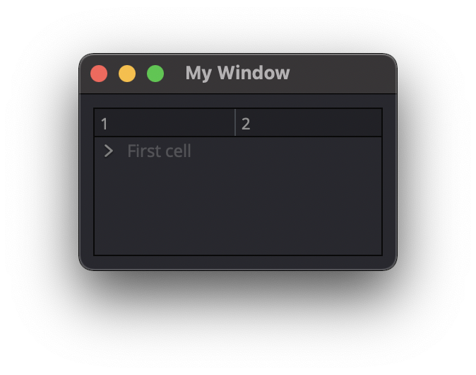
Expanded
Type: bool
Description
This attribute is used to define the expanded status to an item of the Tree. (default=False)
TreeItem must have child to display.
itm = win.Find('my_tree').NewItem()
itm2 = win.Find('my_tree').NewItem()

itm.Text[0] = "First cell"
itm2.Text[0] = "Child of itm"
itm.AddChild(itm2)

win.Find('my_tree').AddTopLevelItem(itm)
itm.Expanded = True
Disabled
Type: bool
Description
This attribute is used to define the disabled status to an item of the Tree. (default=False)
TreeItem will be grayed out.
itm = win.Find('my_tree').NewItem()
itm2 = win.Find('my_tree').NewItem()

itm.Text[0] = "First cell"
itm2.Text[0] = "Child of itm"
itm.AddChild(itm2)

win.Find('my_tree').AddTopLevelItem(itm)
itm.Disabled = True
FirstColumnSpanned
Type: bool
Description
This attribute is used to
Note
Not yet tested
ui.TreeItem({ ‘FirstColumnSpanned’: True })
Flags
Type: bool
Description
This attribute is used to
Note
Not yet tested
ui.TreeItem({ ‘Selected’: True })
ChildIndicatorPolicy
Type: bool
Description
This attribute is used to
Note
Not yet tested
ui.TreeItem({ ‘Selected’: True })
Important
Some elements also have property arrays, indexed by item or column (zero-based), e.g. newItem.Text[2] = ‘Third column text’
Combo
ItemText[index]
Type: string
Description
This attribute is used to get the Item Text of the ComboBox at specified index.
win.Find("combo_1").AddItems(["Blue","Cyan","Green","Yellow","Red","Pink","Purple","Fuchsia","Rose","Lavender","Sky","Mint","Lemon","Sand","Cocoa","Cream"])
first_color = win.Find('combo_1').ItemText[0]
# Blue
TabBar Property Array
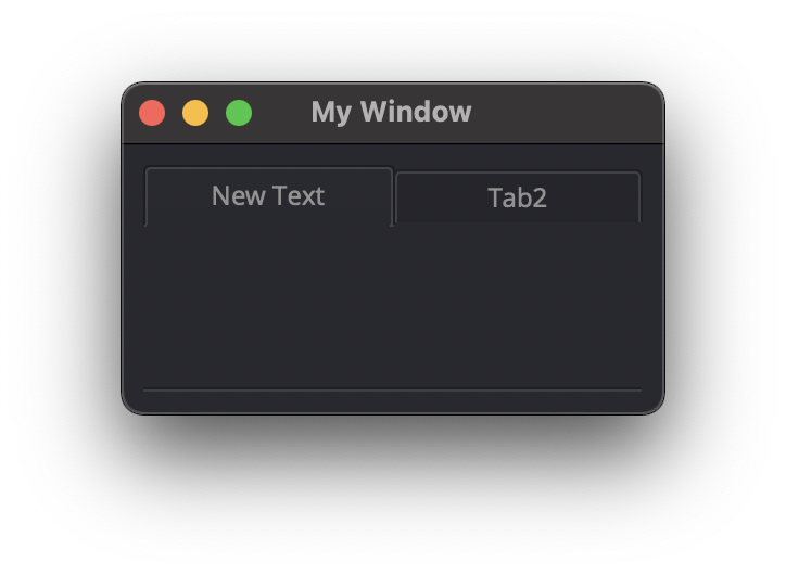
TabText[index]
Type: string
Description
This attribute is used to get or set the Tab Text of the selected Tab index.
ui.TabBar({'ID':'tabbar_1'})

win.Find('tabbar_1').AddTab('Tab1')
win.Find('tabbar_1').AddTab('Tab2')
print(win.Find('tabbar_1').TabText[0])  #Tab1

win.Find('tabbar_1').TabText[0] = 'New Text'
TabToolTip[index]
Type: string
Description
This attribute is used to display a text when mouse hover the tab
ui.TabBar({'ID':'tabbar_1'})
    win.Find('tabbar_1').AddTab('Tab1')

win.Find('tabbar_1').TabToolTip[0] = 'Tool tip'
TabWhatsThis[ ]
Type: string
Description
This attribute is used to
Note
Not yet tested
newItem.TabWhatsThis[2] = “Third Tab WhatsThis Text”
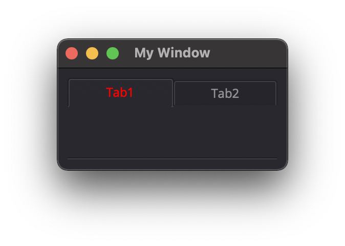
TabTextColor[index]
Type: dict
Description
This attribute is used to change the Tab Text color with RGBA dictionary values.
ui.TabBar({'ID':'tabbar_1'})
    win.Find('tabbar_1').AddTab('Tab1')
    win.Find('tabbar_1').TabTextColor[0] = { 'R':1, 'G': 0, 'B':0, 'A':1 }
Tree Property Array
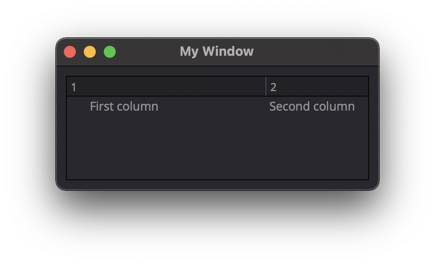
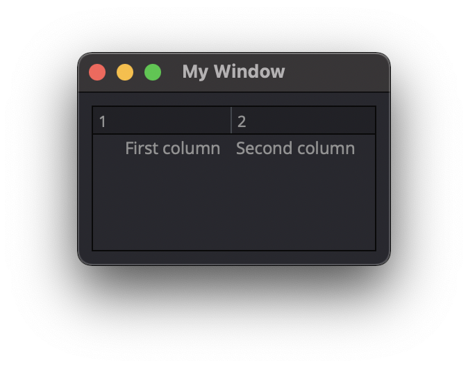
ColumnWidth[index]
Type: int
Description
This attribute is used change the Width of a Tree column
itm = win.Find('my_tree').NewItem()
itm.Text[0] = "First column"
itm.Text[1] = "Second column"
win.Find('my_tree').AddTopLevelItem(itm)

    win.Find('my_tree').ColumnWidth[0] = 200
Treeitem Property Array
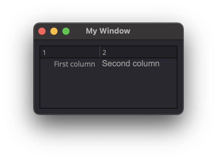
Text[index]
Type: string
Description
This attribute is used to set the TreeItem text at column index
itm = win.Find('my_tree').NewItem()
itm.Text[0] = "First column"
itm.Text[1] = "Second column"

win.Find('my_tree').AddTopLevelItem(itm)
StatusTip[ ]
Type: string
Description
This attribute is used to
Note
Not yet tested
newItem.StatusTip[2] = ‘StatusTip’
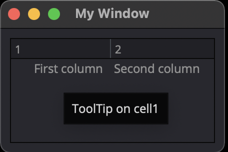
ToolTip[index]
Type: string
Description
This attribute is used to display a text when mouse hover a cell
itm = win.Find('my_tree').NewItem()

itm.Text[0] = "First column"
itm.Text[1] = "Second column"
itm.ToolTip[0] = 'ToolTip on cell1'

win.Find('my_tree').AddTopLevelItem(itm)
WhatsThis[ ]
Type: string
Description
This attribute is used to …
Note
Not yet tested
newItem.WhatsThis[2] = ‘WhatsThis’
SizeHint[ ]
Type: int
Description
This attribute is used to
Note
Not yet tested
newItem.SizeHint[2] = ‘SizeHint inside Tree in third row’
TextAlignment[ ]
Type:
Description
This attribute is used to
Note
Not yet tested
newItem.TextAlignment[2] = ‘TextAlignment inside Tree in third row’
CheckState[ ]
Type: bool
Description
This attribute is used to
Note
Not yet tested
newItem.CheckState[2] = ‘CheckState inside Tree in third row’
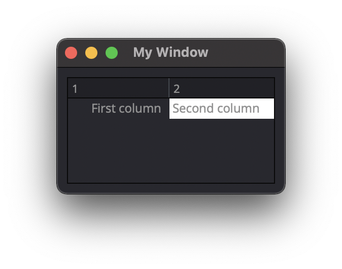
BackgroundColor[index]
Type: dict
Description
This attribute is used to set a BackgroundColor to a cell using RGBA dictionary.
Note
Not yet tested
itm = win.Find(‘my_tree’).NewItem()
itm.Text[0] = “First column” itm.Text[1] = “Second column” itm.BackgroundColor[1] = {‘R’:1, ‘G’:1, ‘B’:1, ‘A’:1}
win.Find(‘my_tree’).AddTopLevelItem(itm)
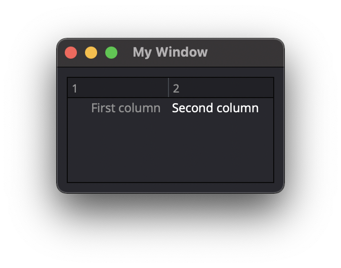
TextColor[index]
Type: dict
Description
This attribute is used to change the color of the text using RGBA dictionary
Note
Not yet tested
itm = win.Find(‘my_tree’).NewItem()
itm.Text[0] = “First column” itm.Text[1] = “Second column” itm.TextColor[1] = {‘R’:1, ‘G’:1, ‘B’:1, ‘A’:1}
win.Find(‘my_tree’).AddTopLevelItem(itm)
Icon[index]
Type: ui.Icon
Description
This attribute is used to add an icon image into a cell.
Refer to Icon for property list.
itm = win.Find('my_tree').NewItem()

itm.Text[0] = "First column"
itm.Text[1] = "Second column"
itm.Icon[1] =  ui.Icon({'File': r"UserData:/Scripts/images/logo.png"})

win.Find('my_tree').AddTopLevelItem(itm)
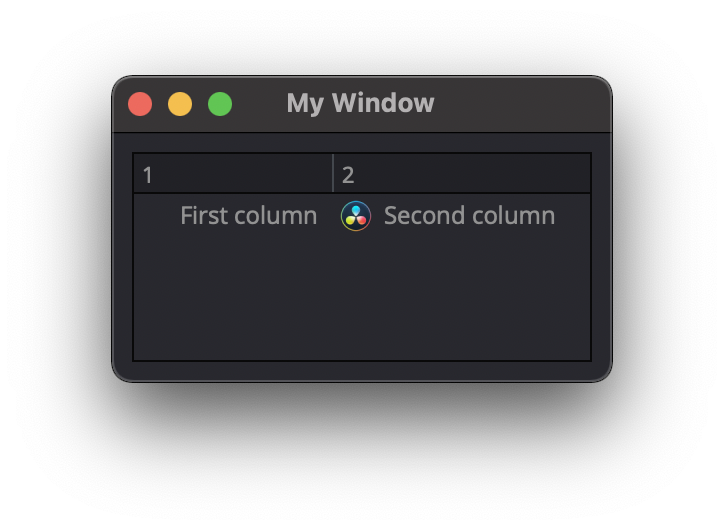
Font[index]
Type: ui.Font
Description
This attribute is used to modify the Font used inside a cell.
Refer to Font for property list.
itm = win.Find('my_tree').NewItem()

itm.Text[0] = "First column"
itm.Text[1] = "Second column"
itm.Font[1] =  ui.Font({ 'Family': "Arial", 'PointSize': 14})

win.Find('my_tree').AddTopLevelItem(itm)
Some elements like Label and Button will automatically recognise and render basic HTML in their Text attributes, and TextEdit is capable of displaying and returning HTML too. Element attributes can be specified when creating the element, or can be read or changed later:
win.Find('myButton').Text = "Processing..."
Timer
Interval
Type: int
Description #NotInReadme
This attribute is used to set a time in milisecs to the ui.Timer Element.
    ui.Timer({ 'ID': 'MyTimer', 'Interval': 1000 })  # 1000 millisecs
mytimer.Start()
    dispatcher['On']['Timeout'] = OnTimer  #this create a loop each 1000ms
Singleshot
Type: int
Description
This attribute is used to
Note
Not yet tested
ui.Timer({ ‘ID’: ‘MyTimer’, ‘Singleshot’: 1000 })
RemainingTime
Type: int
Description
This attribute is used to
Note
Not yet tested
ui.Timer({ ‘ID’: ‘MyTimer’, ‘RemainingTime’: 1000 })
IsActive
Type: bool
Description
This attribute is used to
Note
Not yet tested
ui.Timer({ ‘ID’: ‘MyTimer’, ‘IsActive’: True })